Alphabet Collection, Summer 2024
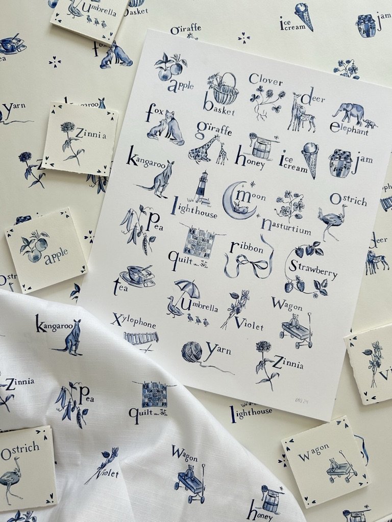
This one feels like it has been a long time coming- I am really happy to share that the Alphabet Collection is now live to shop! This collection, which features twenty-six original watercolors on paper, a 16x20 print, and a new wallpaper and home textile design, is inspired by the 80s and 90s nursery decor of my childhood, and an ever-growing obsession with Delft pottery.
While I started painting the letters for this at the start of the new year, I’d jotted plans for this collection early last fall, after coming across a few yards of vintage Laura Ashley fabric on Etsy. I spend a lot of time on Etsy looking through vintage and deadstock textiles, as I like to collect them for projects, and this one stopped me dead in my tracks while scrolling one night. The fabric was “Alphabeta,” an out-of-print design by Laura Ashley from 1992, and while I fell in love with it immediately, the shipping from the UK cost more than I was willing to spend for something I didn’t have set plans for (I don’t even sew, although learning how to do so is always on my to-do list).
After a month or two of searching and realizing that I couldn’t find it (or anything remotely similar) available anywhere else on the internet, I did two things- I hit “purchase” on the Etsy listing, and I set out to make my own blue and white alphabet textile, with my own original spin.
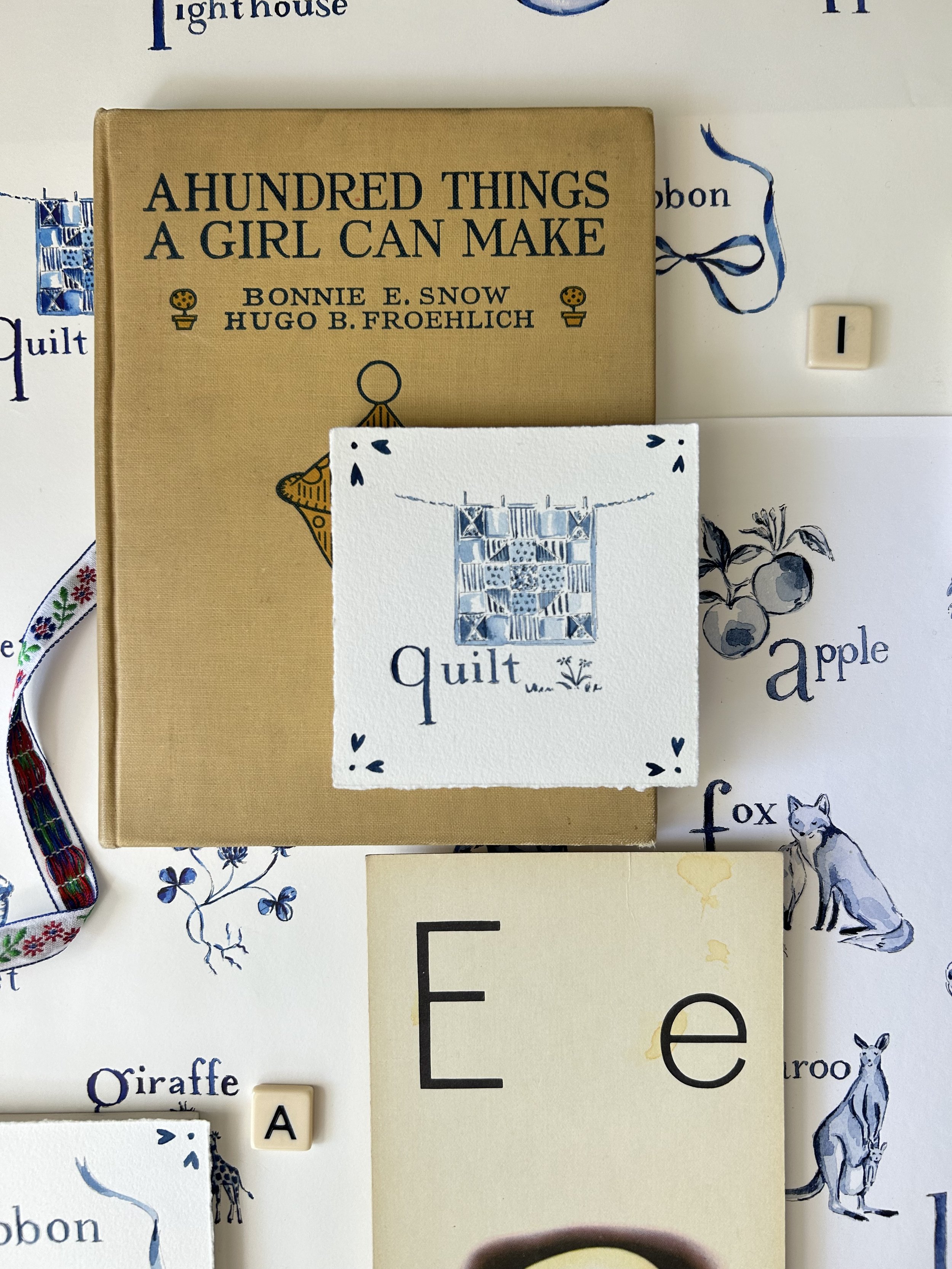
I chose twenty-six unique objects to represent each letter- there’s a mix of animals, flowers, and miscellaneous sweet nursery-friendly things- and painted each one on a 4x4” square, using the same scale and color palette featured in my “Modern Motherhood” series (I worked on these alongside the originals for my book, so it was easy to go back and forth between the two projects). I added some Delft-tile-inspired flourishes to the corners of each illustration, and wrote the letters and names of the objects in a font pulled from my favorite book, Tuck Everlasting.
While I adore the Laura Ashley 1992 inspiration pattern, it was really important to me to make this collection and textile my own, so I chose a unique font and objects, and played around with the layout for the textile design, incorporating the Delft flourishes throughout. Finally, I designed a 16x20 fine art print featuring the alphabet (as a side-note- when my mom first saw it, she said she’d love to see it matted in blue and white gingham, and I love this idea).
I know that I say this whenever we launch a new fabric/wallpaper design, but I truly can’t wait to see this one installed in homes. I said the same thing about my “Whimsy” pattern from last year’s collection, and I feel similarly about the two patterns because both involved so much work and planning, but I think that the end results are really worth it! Thank you, as always, for following along and supporting my dream!


